
Objective
To develop a cohesive, modernized family of logos that honors UNF’s established brand while infusing a fresh, bold look. The goal was to maintain the recognizable Ospreys identity while introducing a visual update that resonates with both the current community and future audiences.
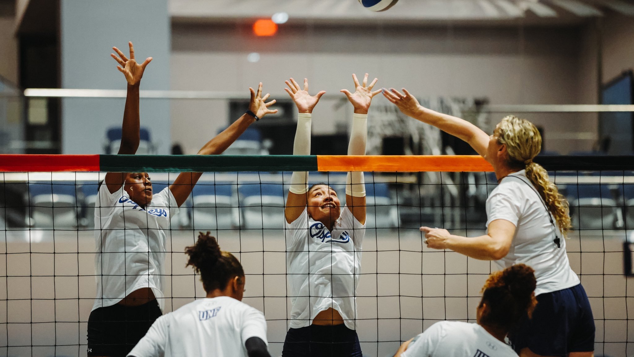
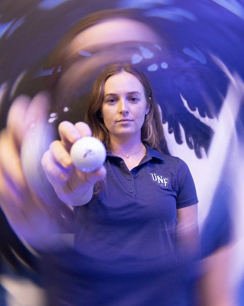
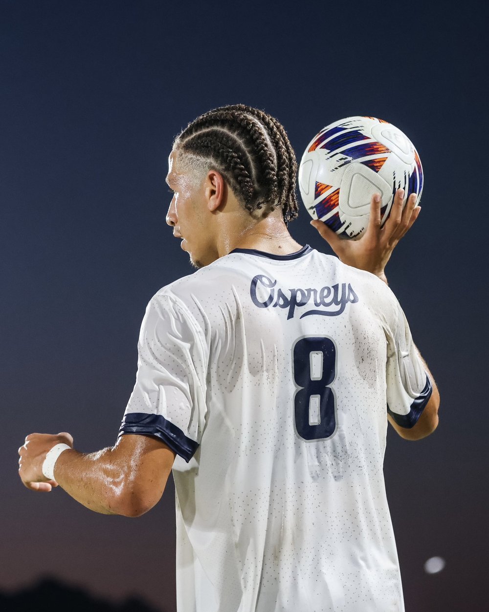
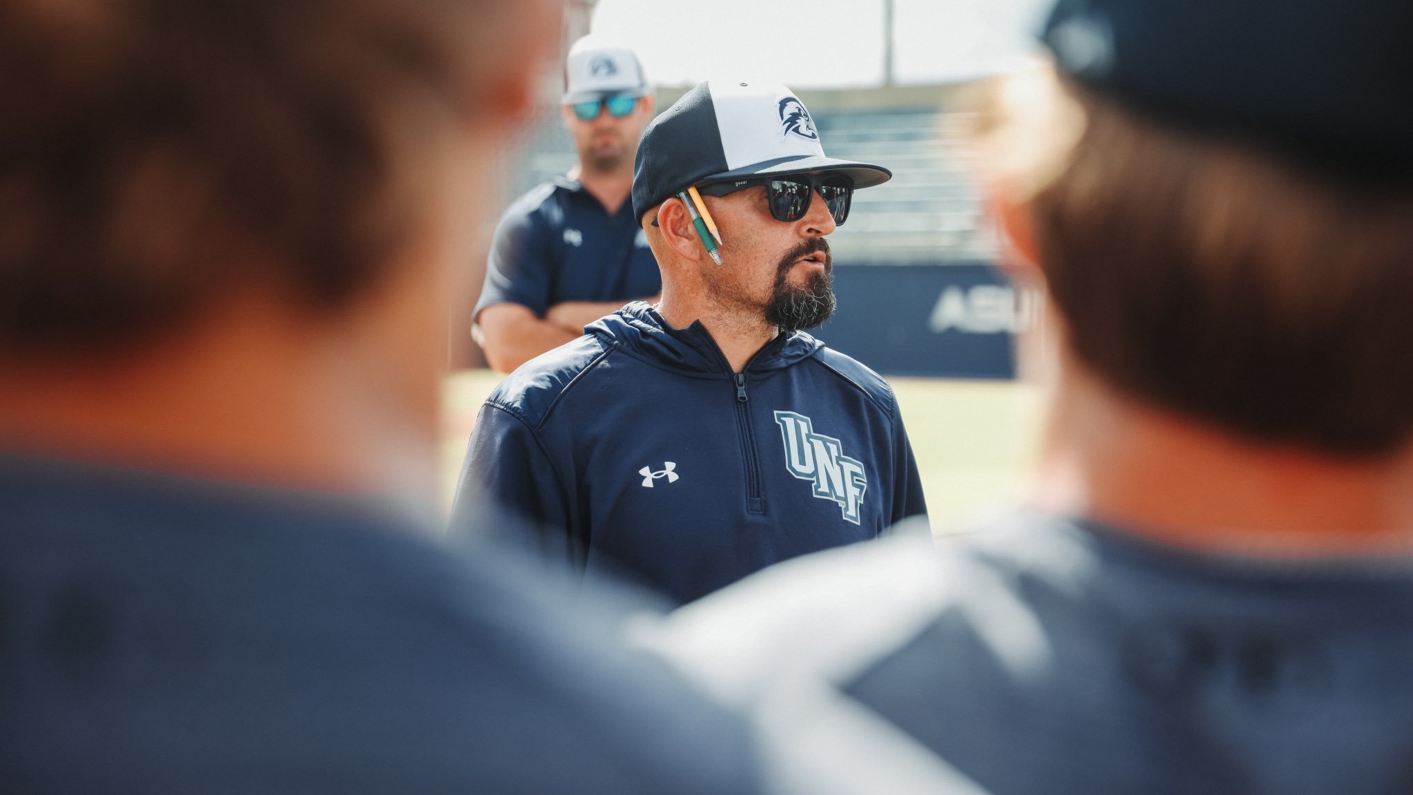
*All images courtesy of UNF Athletics
Client: University of North Florida
Deliverables:
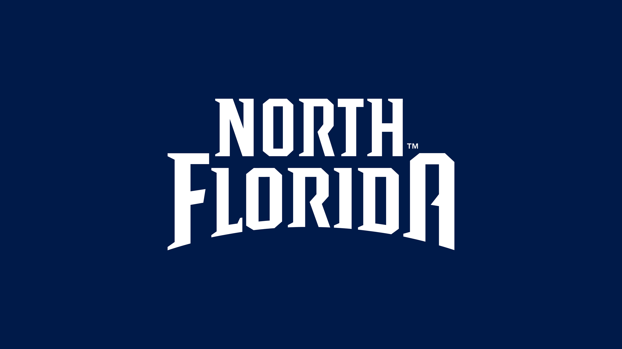
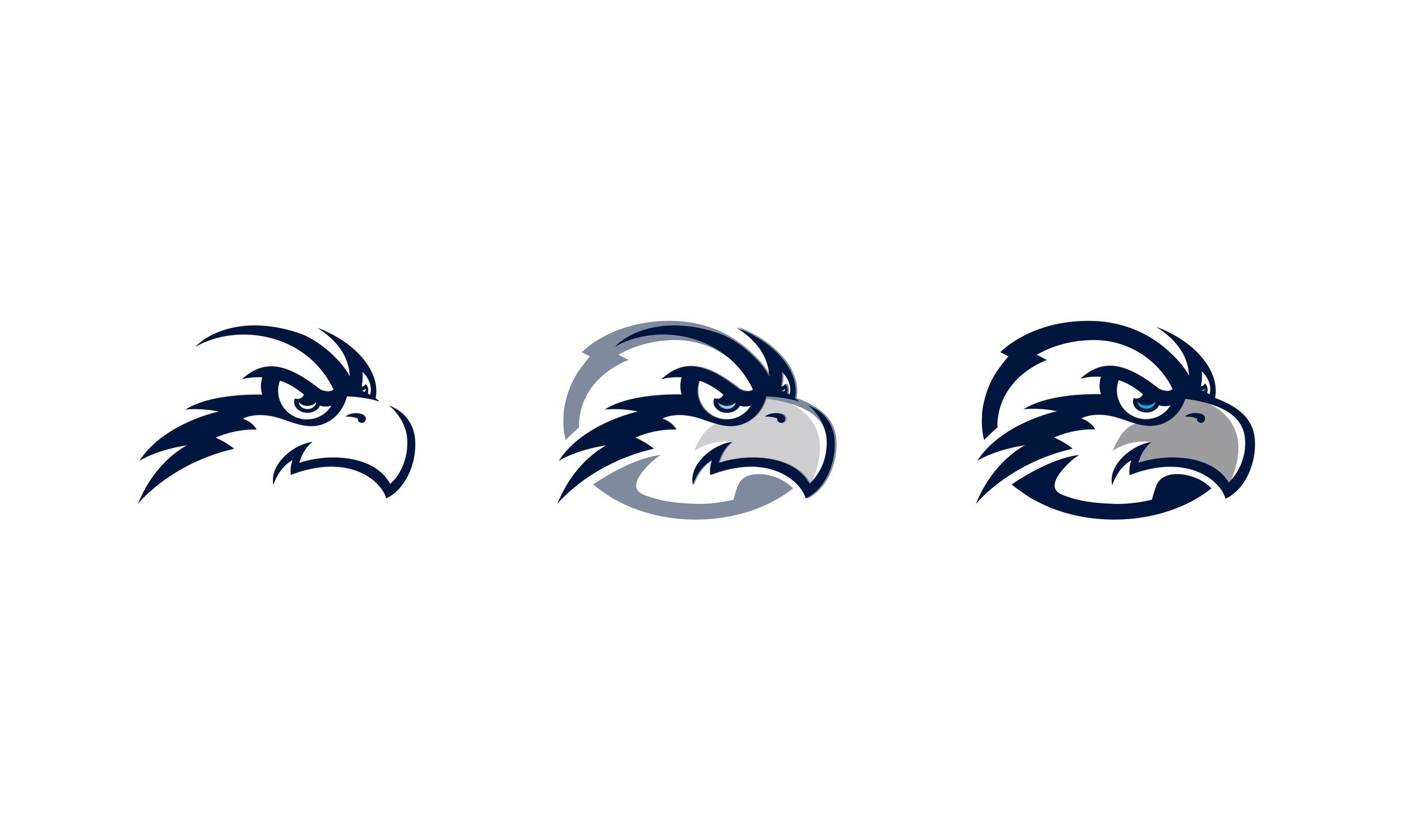
New Ospreys Head
Cleanup Wordmarks
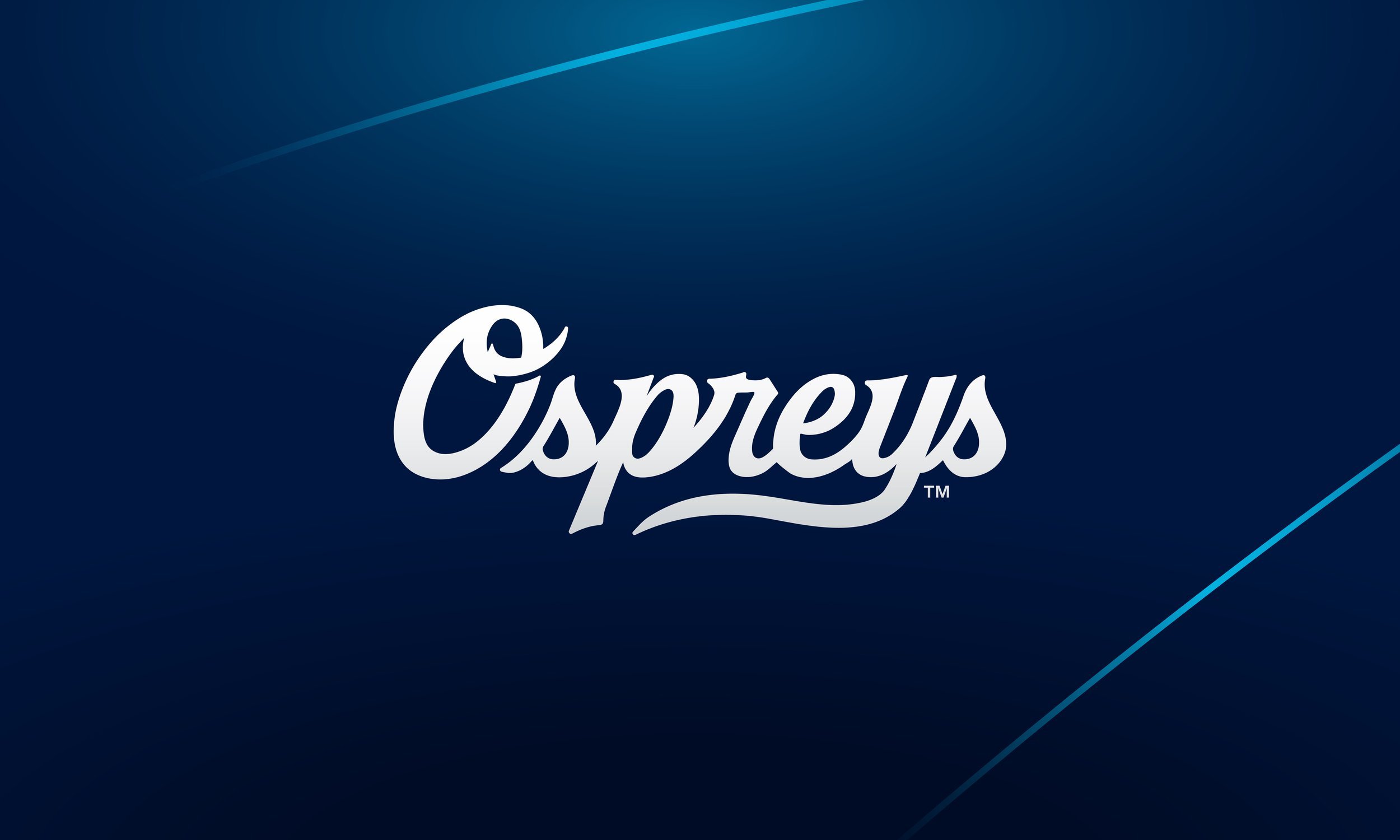
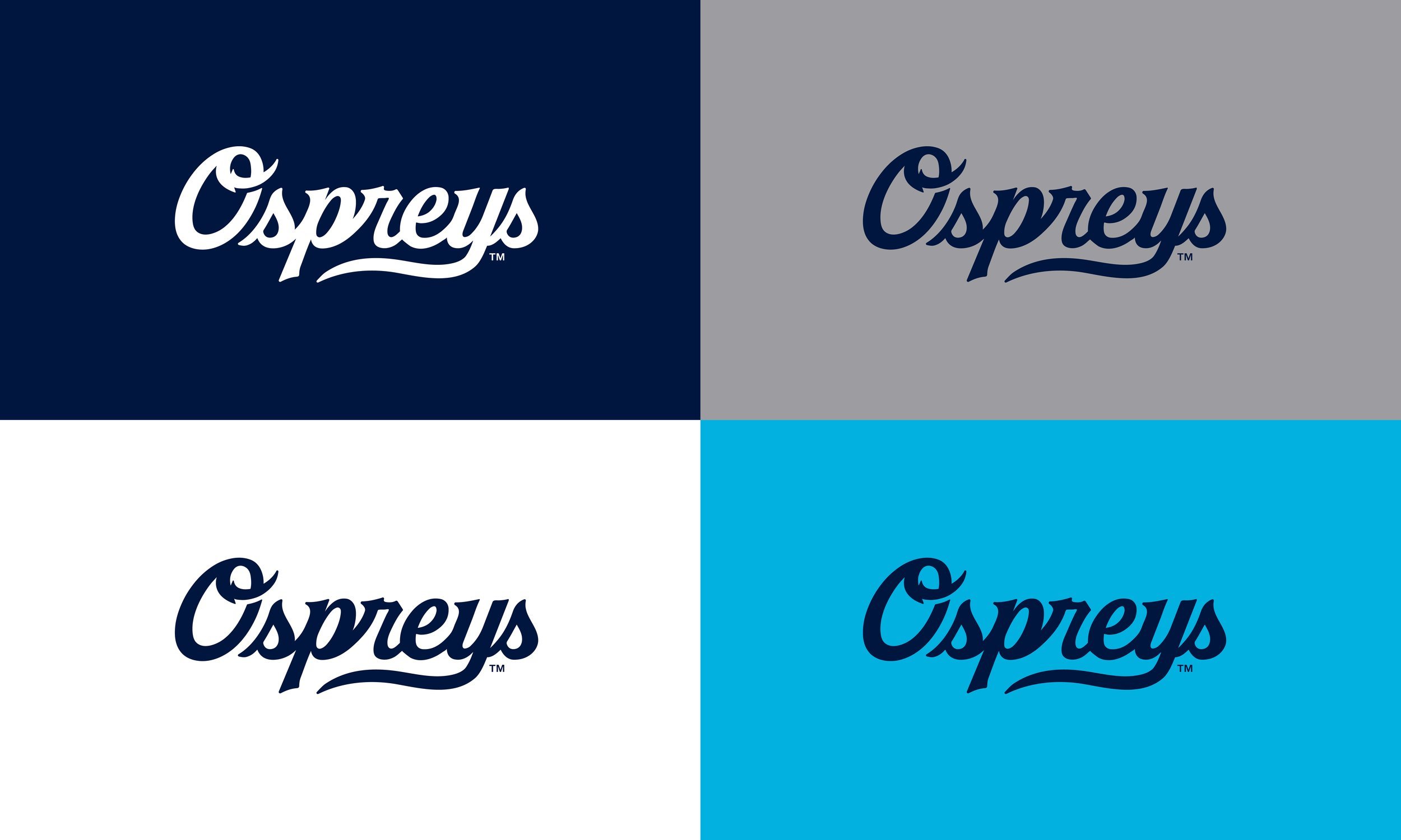
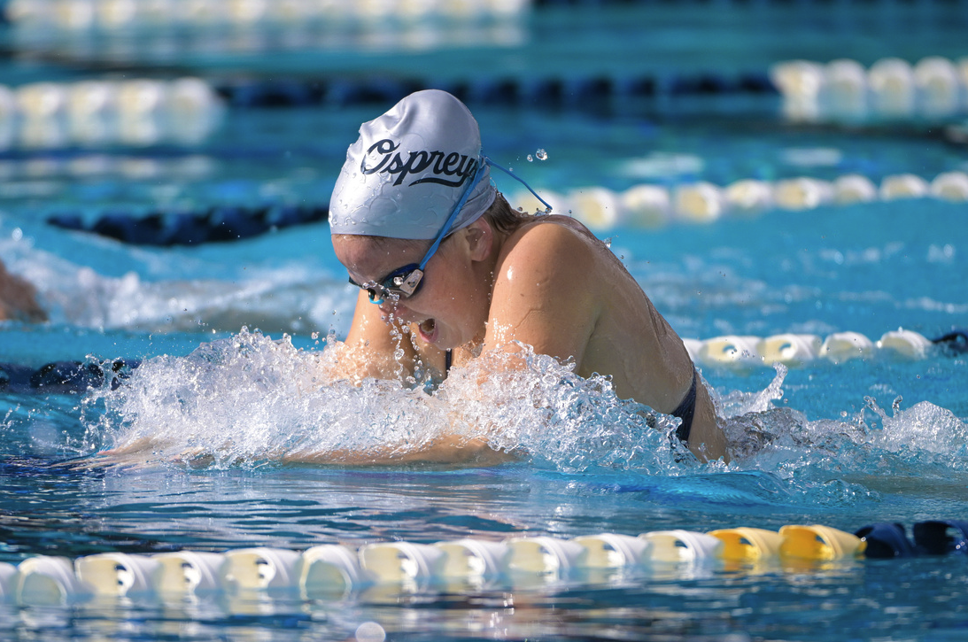
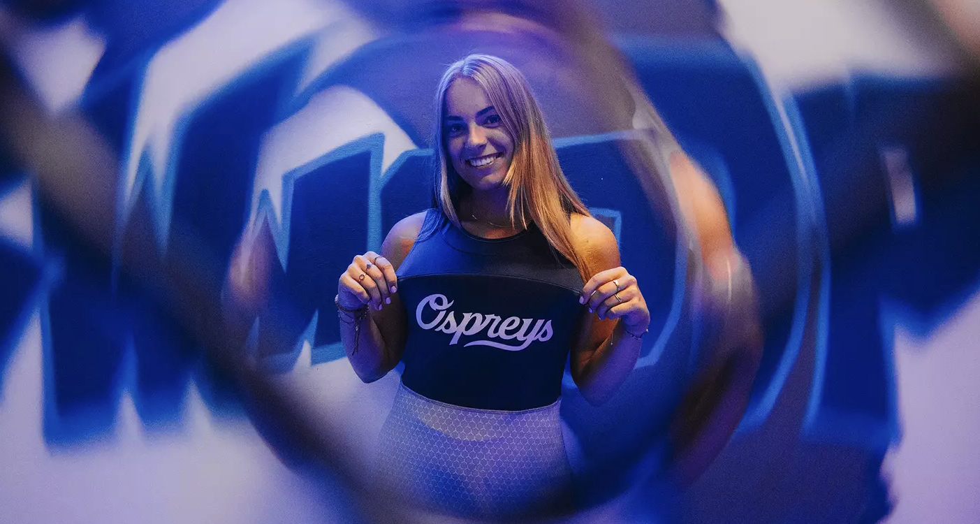
Ospreys Script
Sport Specific Talon Marks


Solution
Our team revitalized the Ospreys' logo, centering the redesign on an energized bird head icon. This refreshed emblem delivers a bold, consistent image across all backgrounds, streamlining brand recognition. In addition, we introduced aqua blue as an accent color, a nod to UNF’s coastal location, enriching the brand’s story and connection to the region.

Results
The new logo family offers a simplified yet powerful identity for UNF, aligning the Ospreys with a modern aesthetic that remains true to the brand’s core identity.