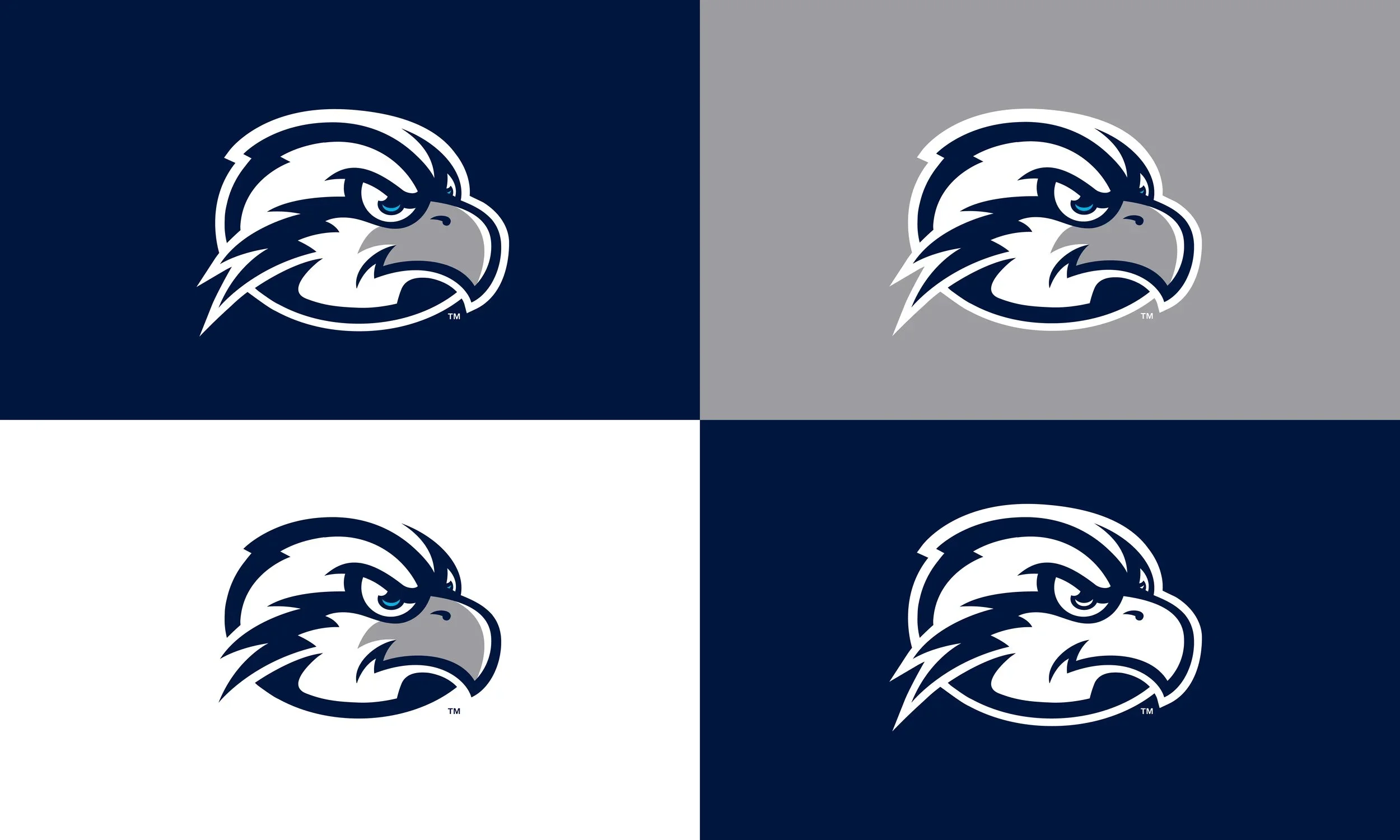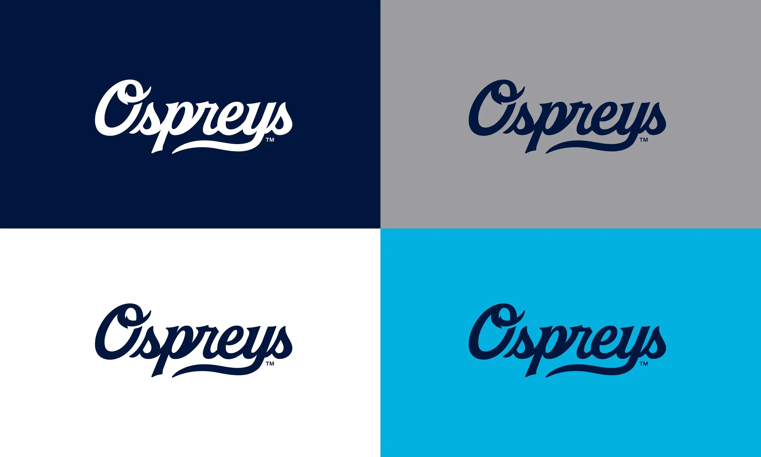
Objective
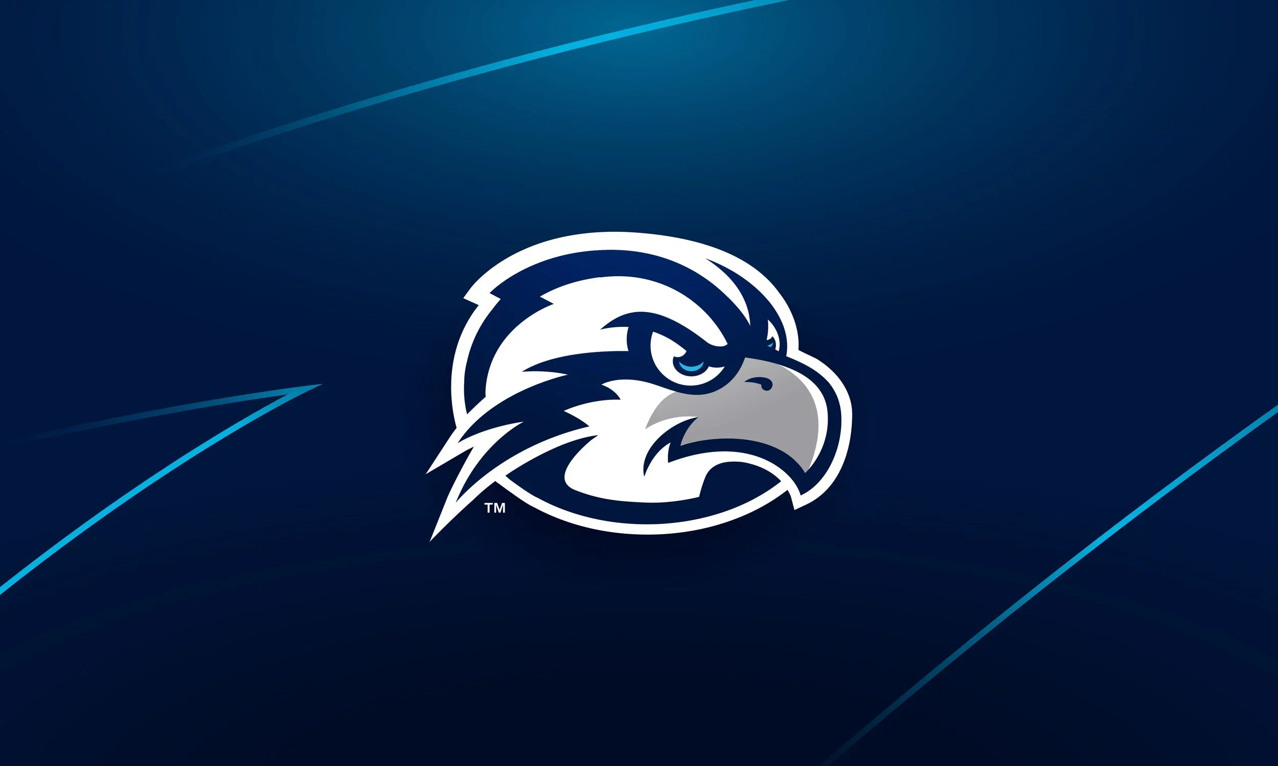
This project aimed to create a new family of logos that simplifies and modernizes the UNF brand while maintaining the same bold look that has identified the Ospreys over the past ten years. The centerpiece for this refresh was the energized bird head that now remains consistent across all backgrounds, and introduces aqua blue as a new brand color representing UNF’s proximity to the coast.
*All images courtesy of North Florida Ospreys
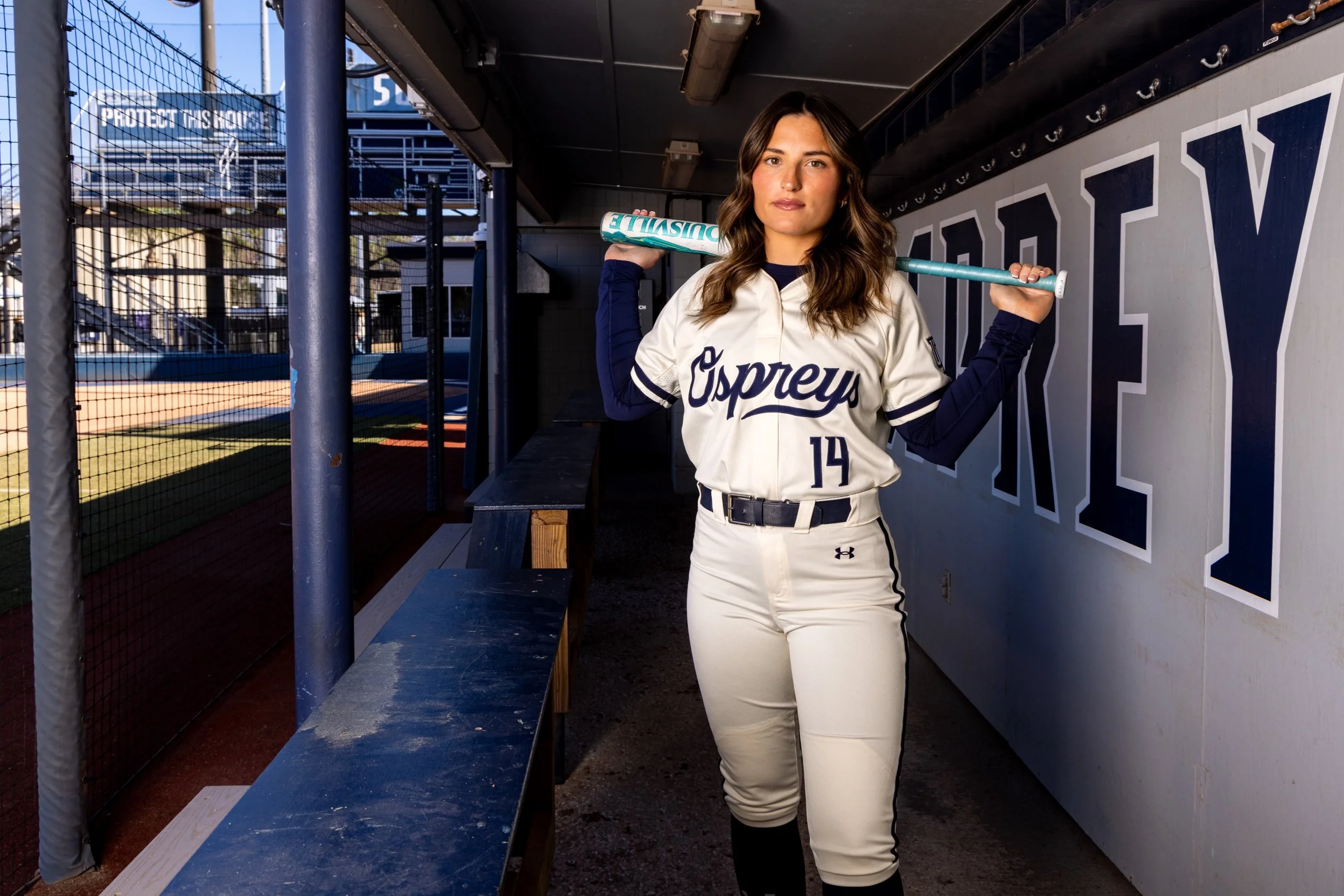
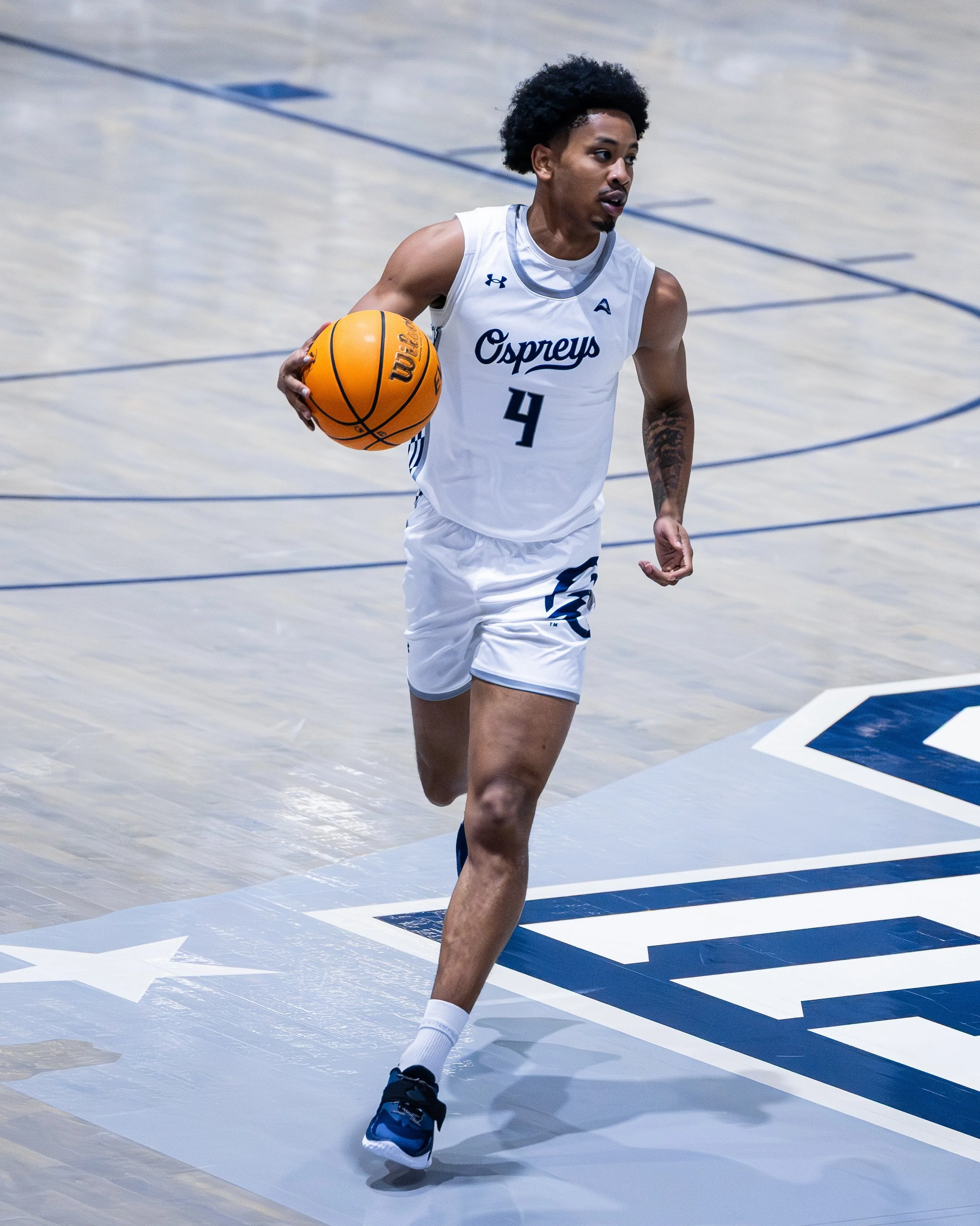
Client: University of North Florida
Deliverables:
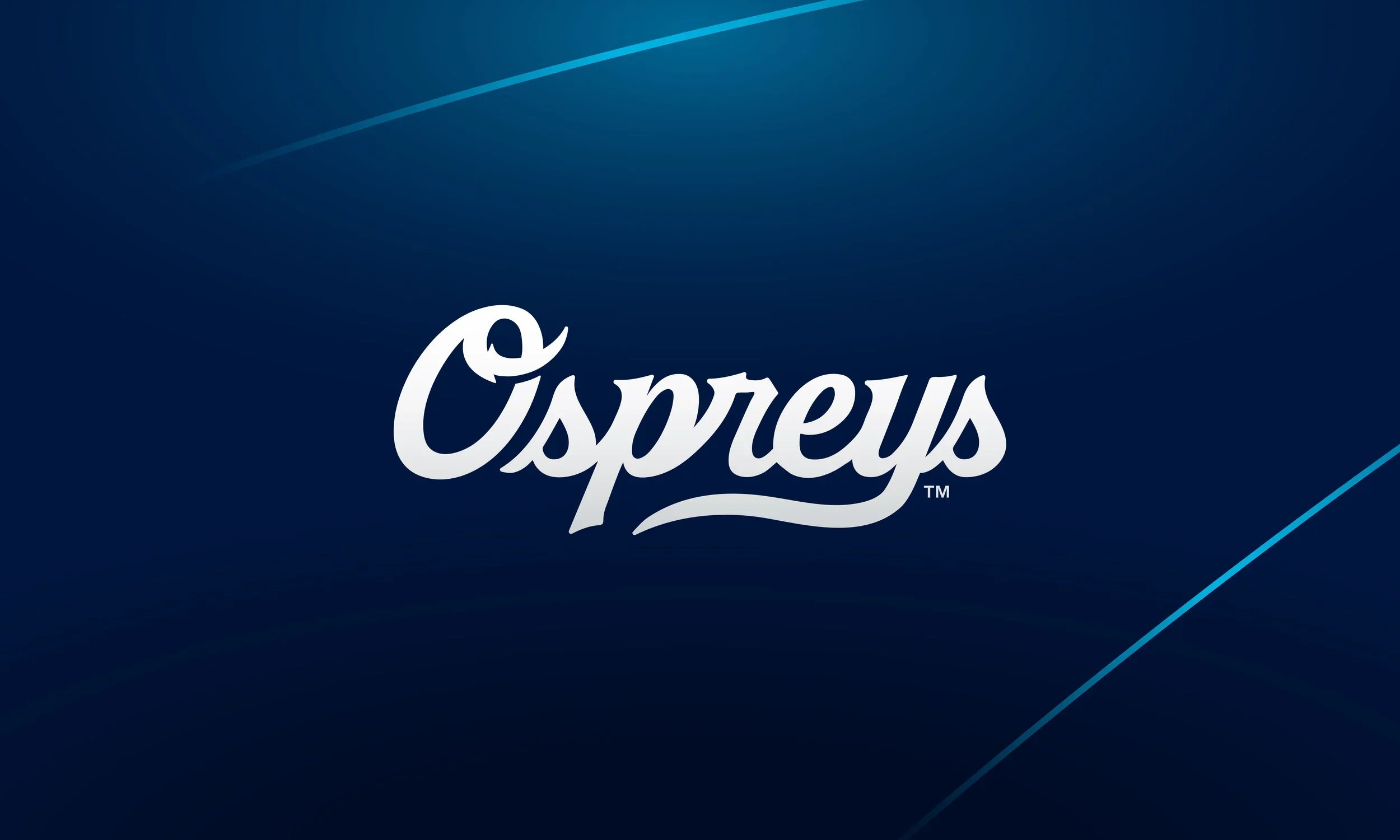
Refreshed Primary
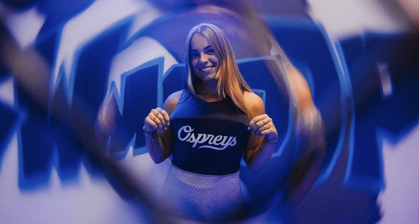
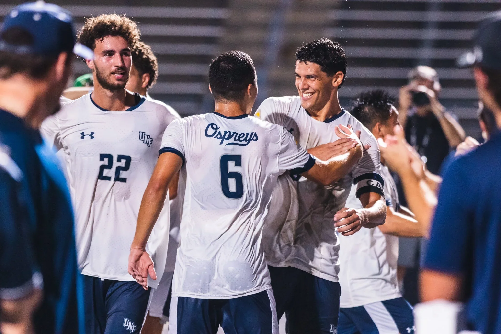
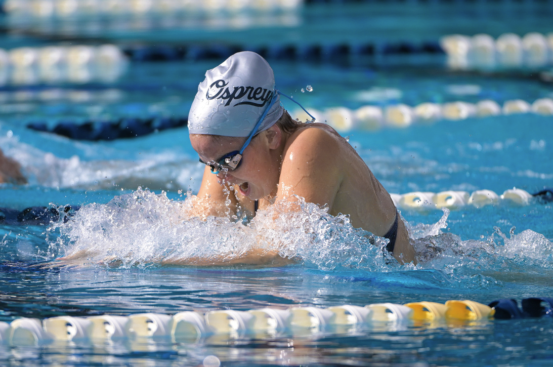
‘Ospreys’ script wordmark
Simplified Wordmarks
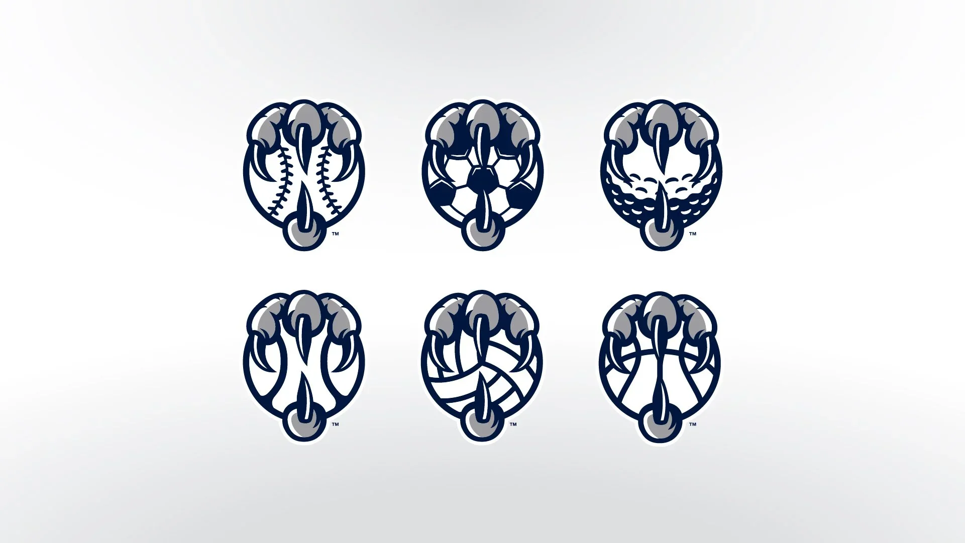
Updated Tertiary Claw sport-specific Logos