

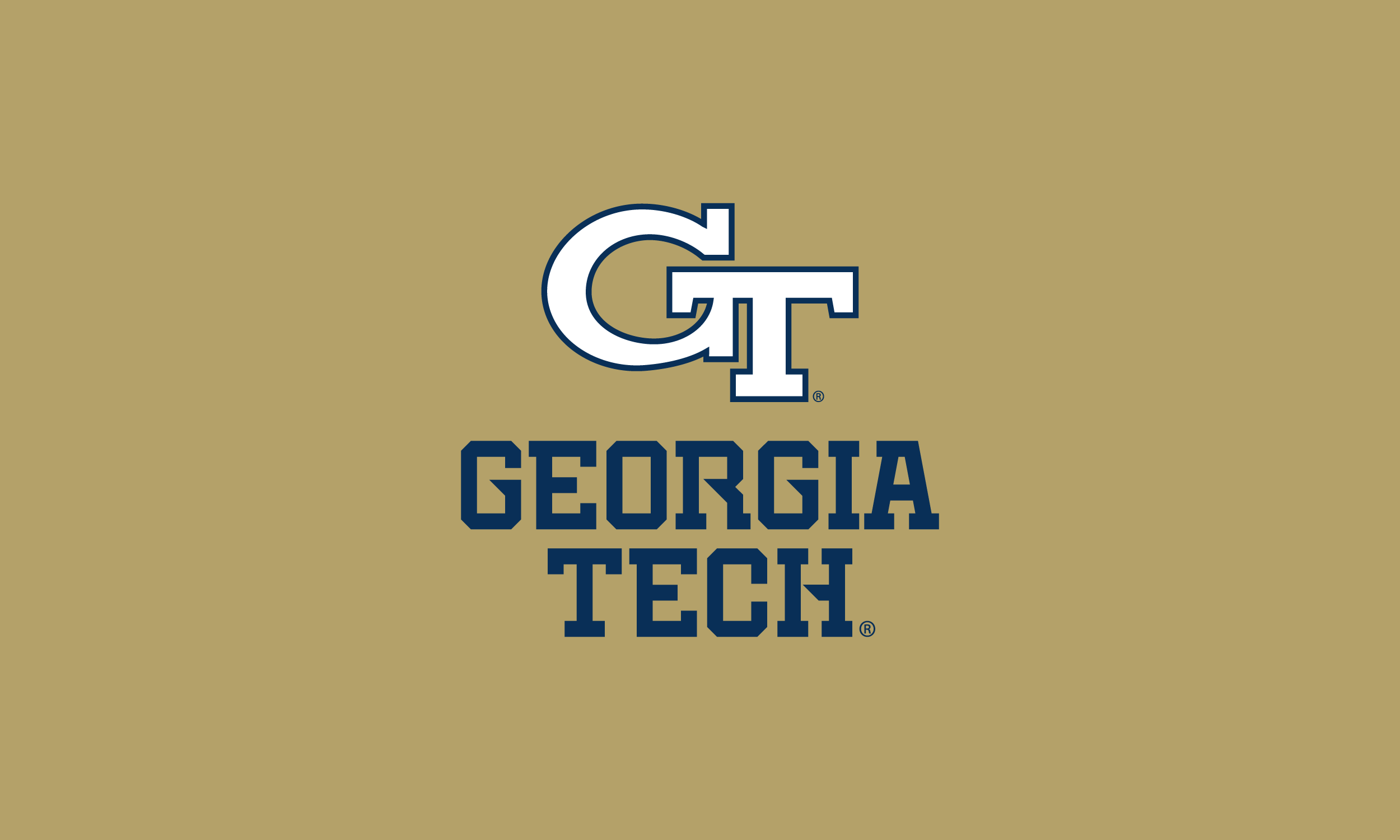
Georgia Tech
Learfield Creative developed a unified, modern wordmark for Georgia Tech Athletics to align all athletic teams under a consistent brand identity. The initiative aimed to enhance brand recognition among fans, increase the program’s marketability and build a stronger sense of alignment connection across teams and the Georgia Tech community.
*All images courtesy of GT Athletics
Client: Georgia Tech
Deliverables:
Brand Strategy
Color Audit
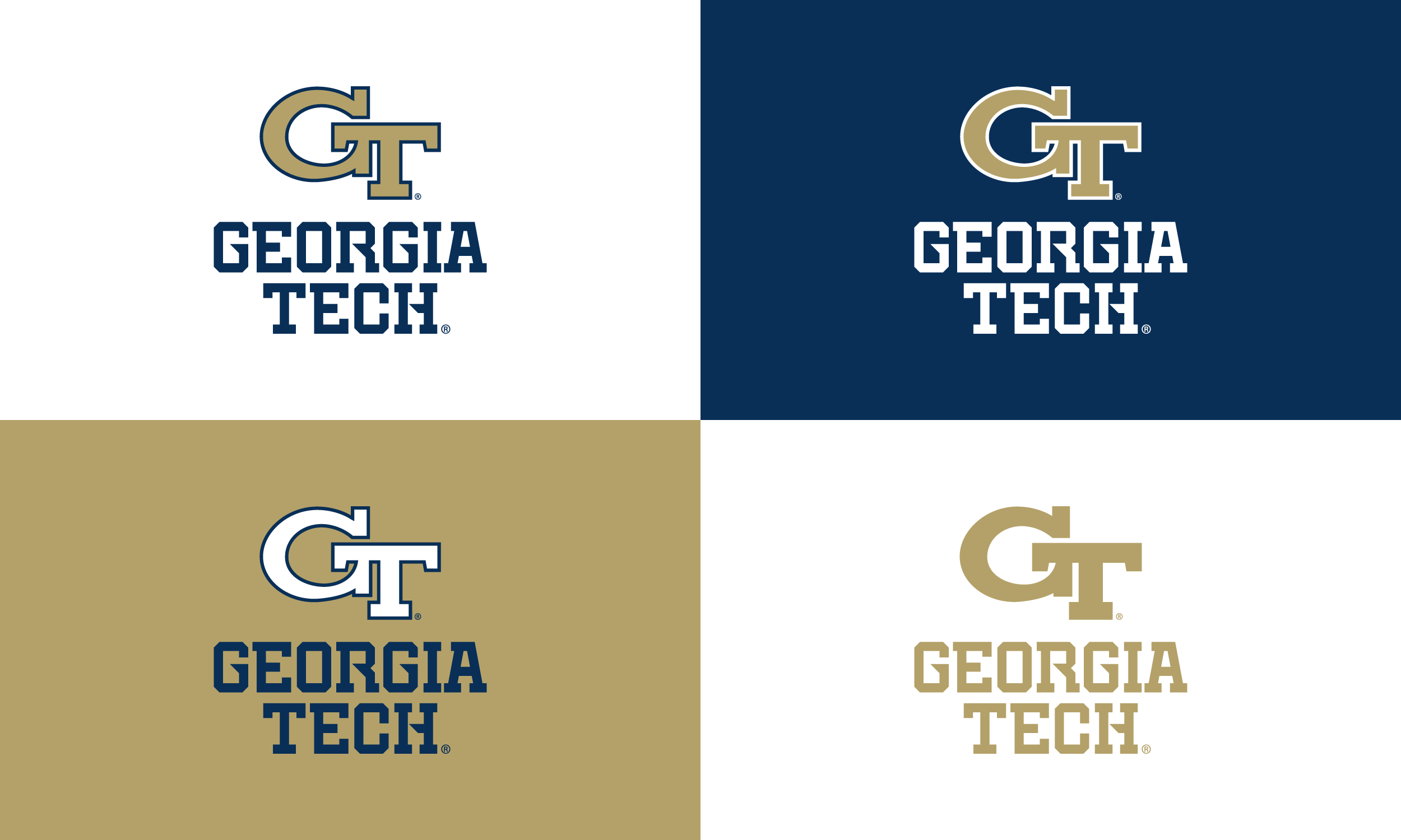
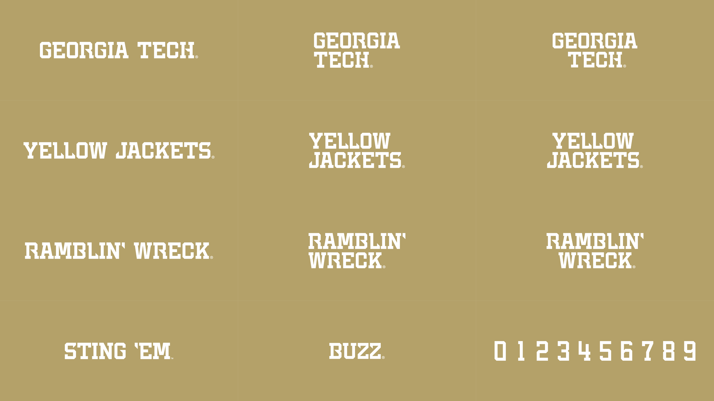
Wordmarks
Numerals
The Strategy
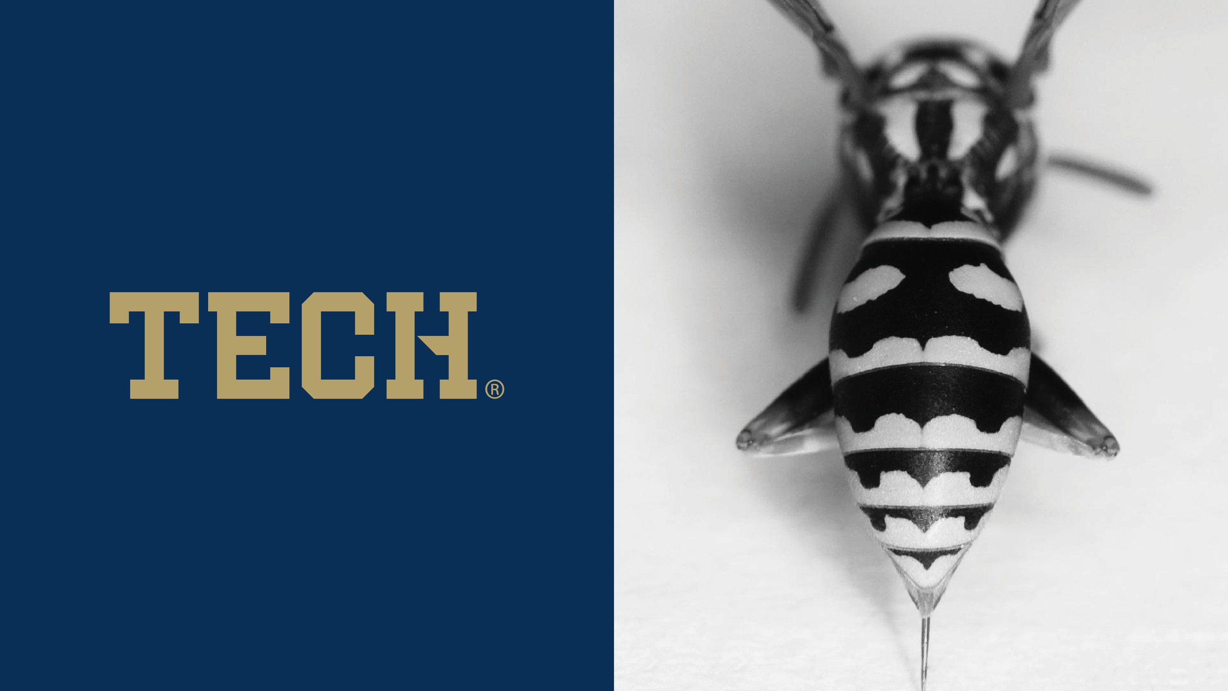
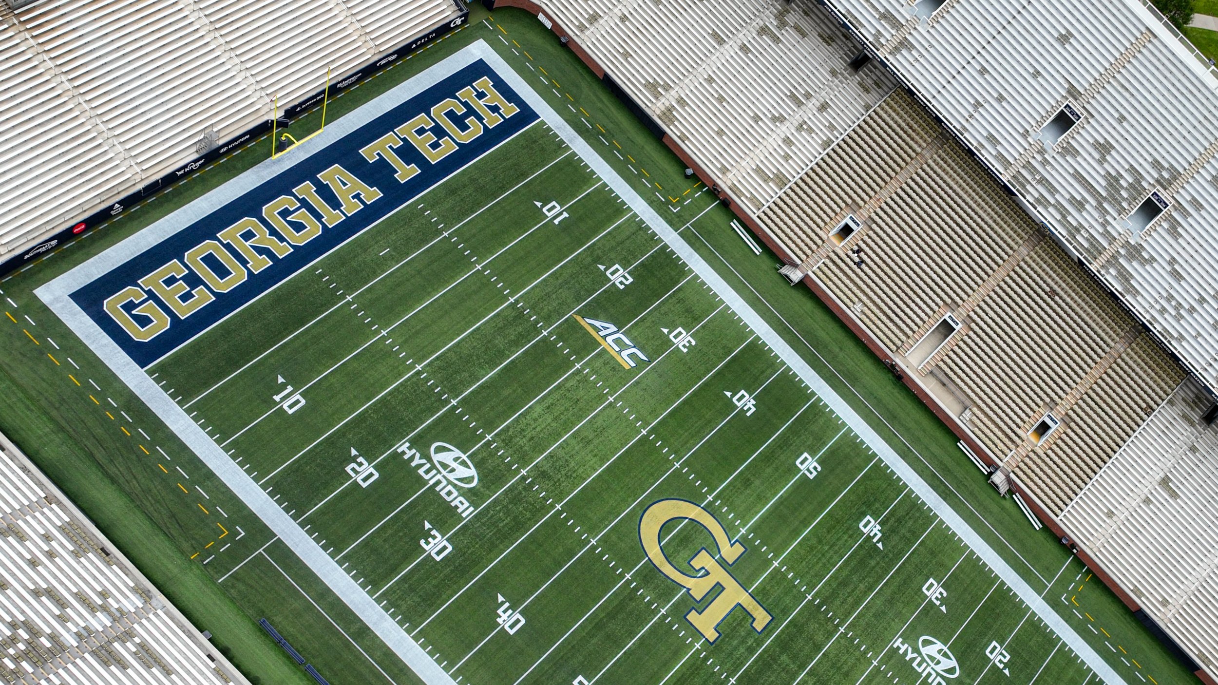
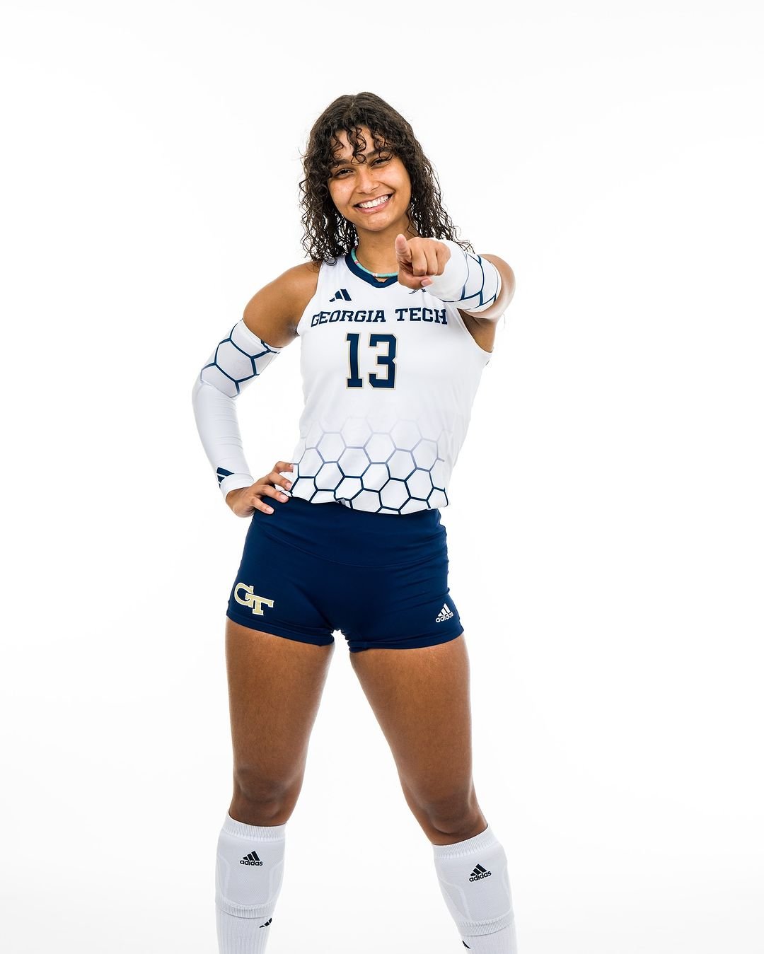
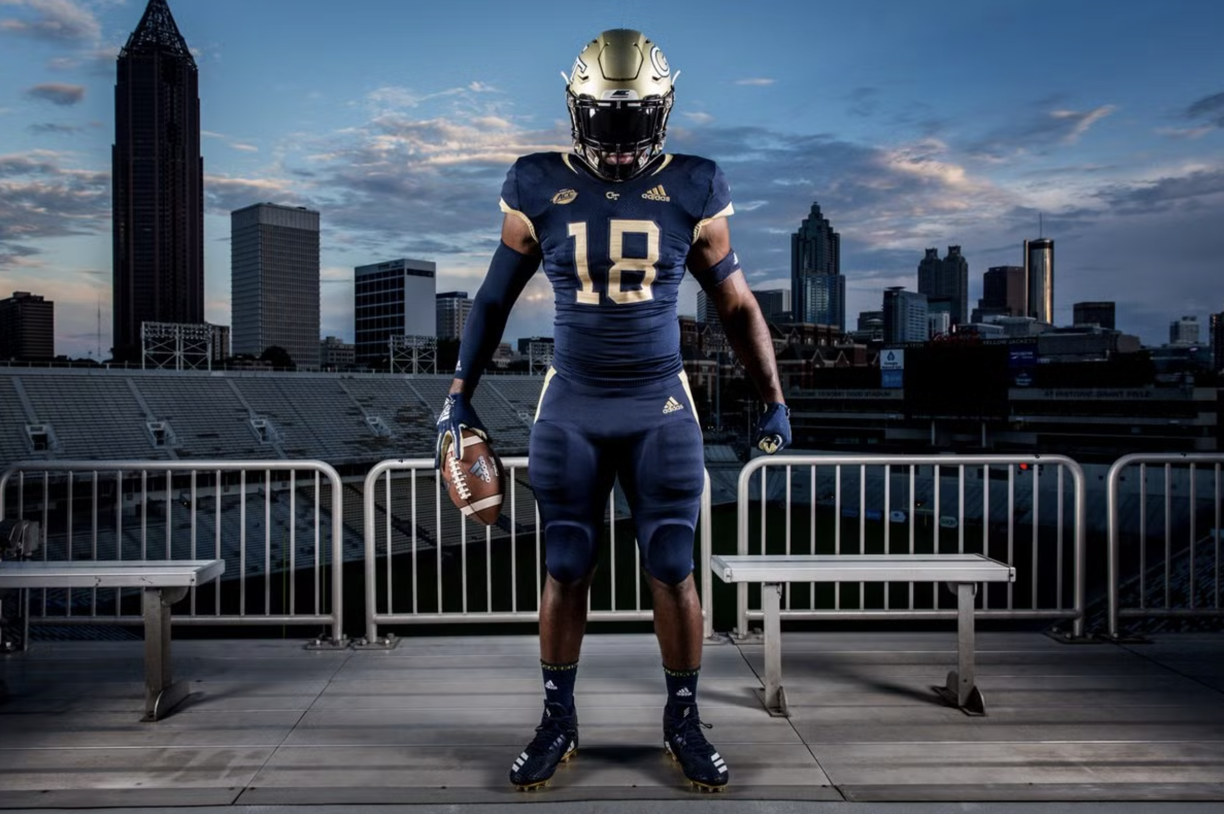
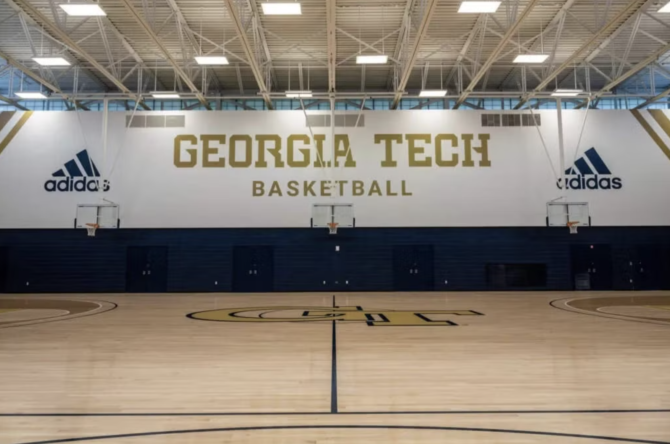
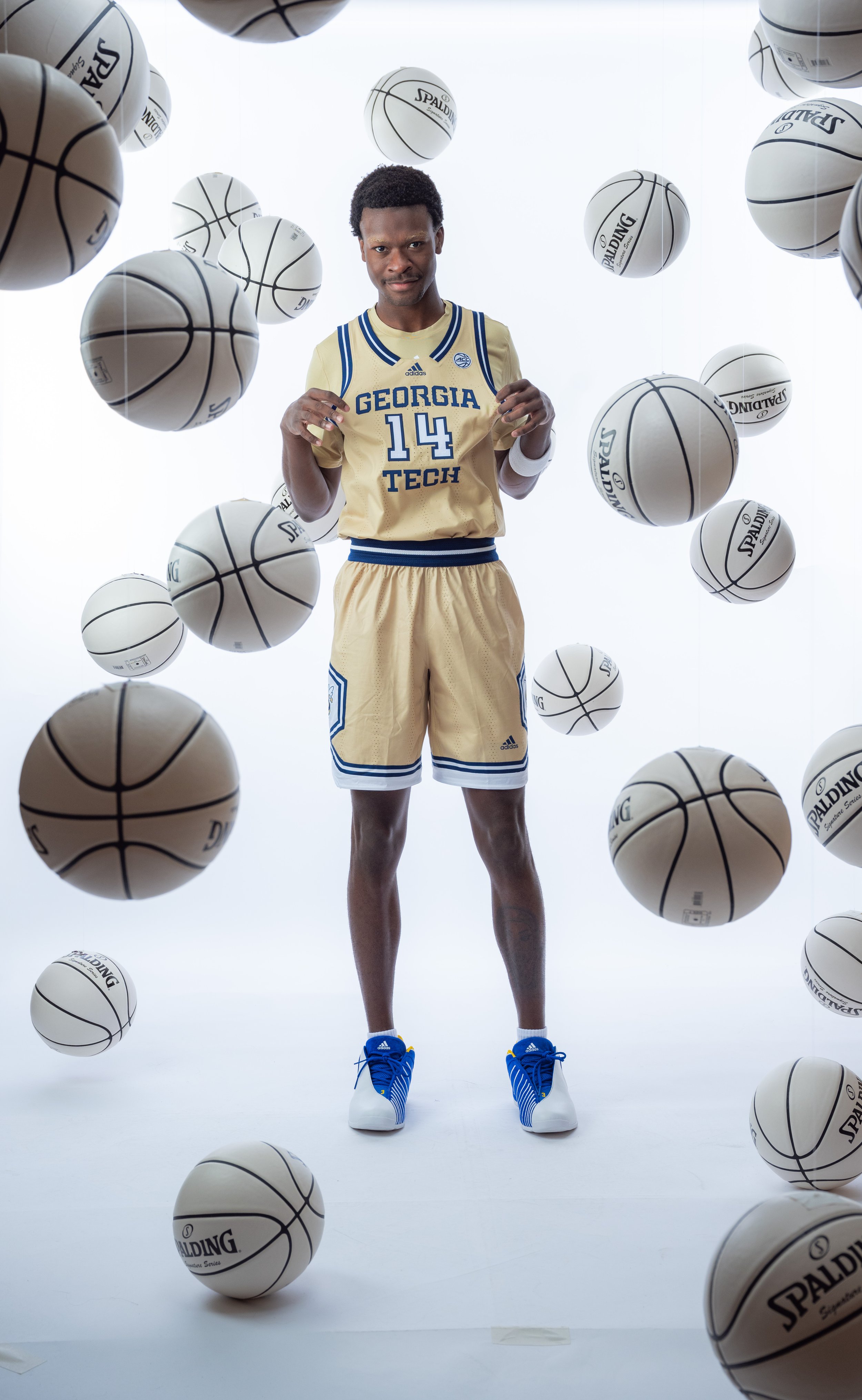
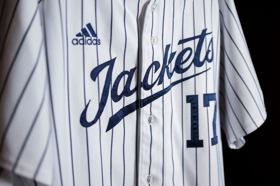
To address the University’s challenges, we designed a custom athletic wordmark. A solution that was intented to be bold, simple and instantly recognizable—ensuring maximum impact across all platforms. We incorporated proprietary “stingers” into the font design as a nod to Georgia Tech’s traditions and history, blending modern aesthetics with the institution’s rich heritage.


Results
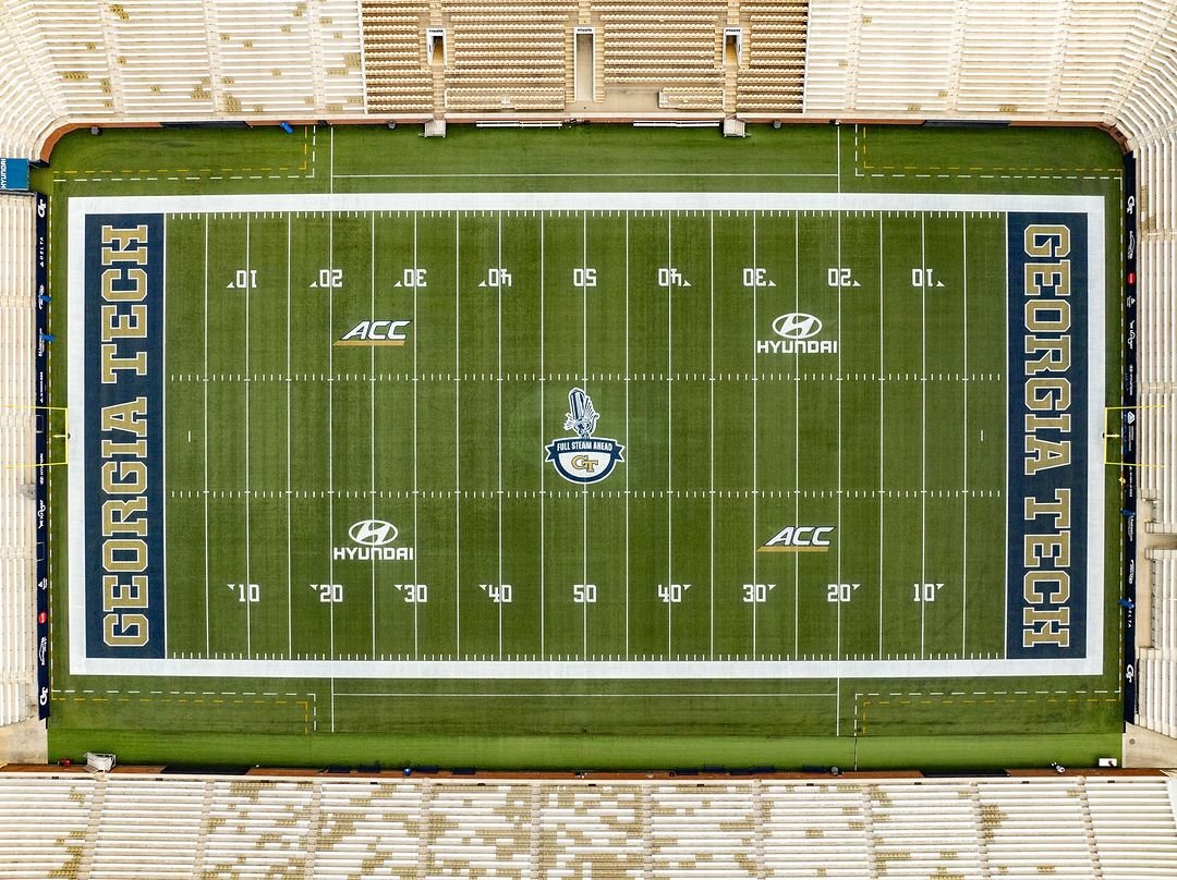
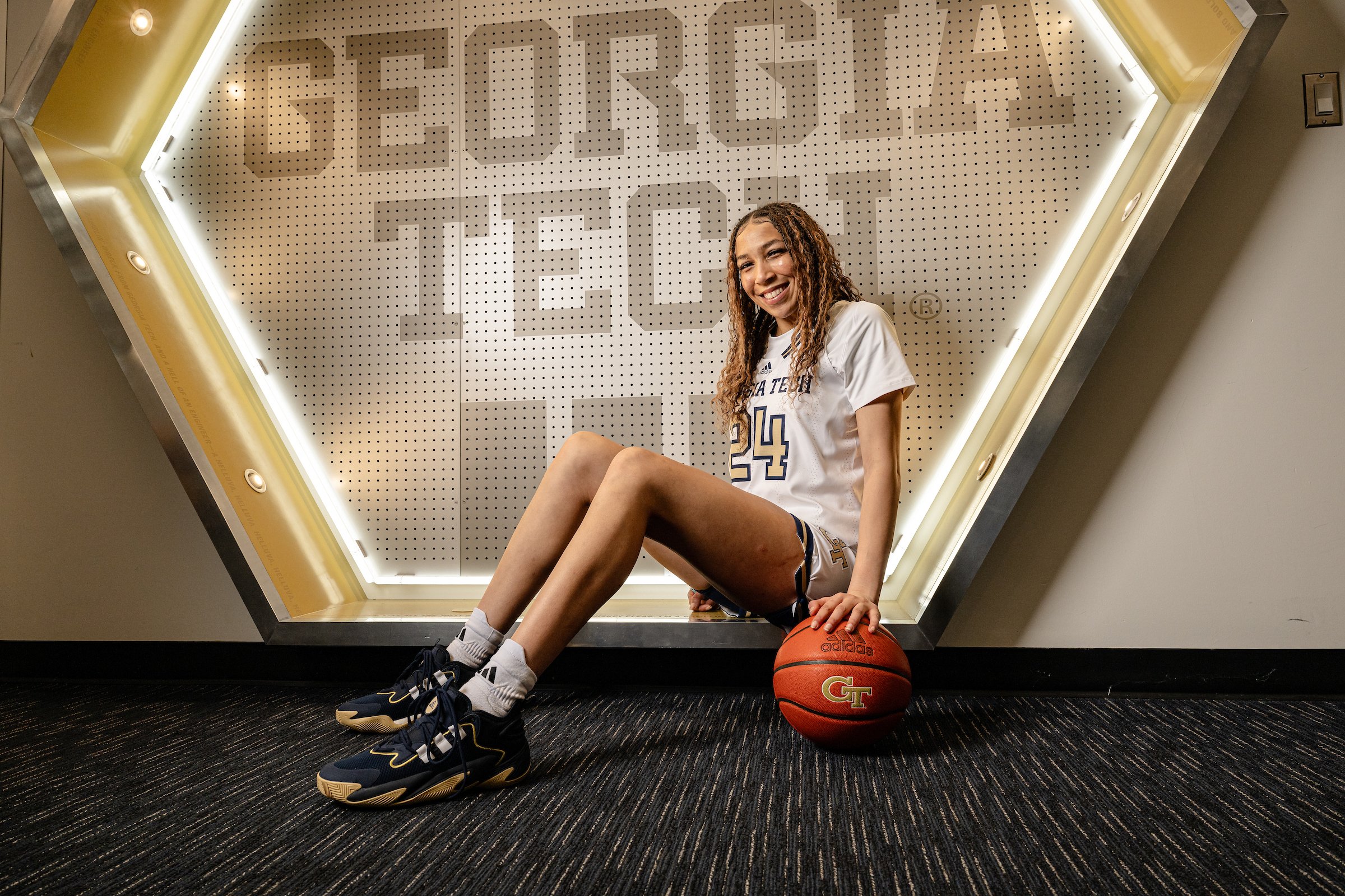
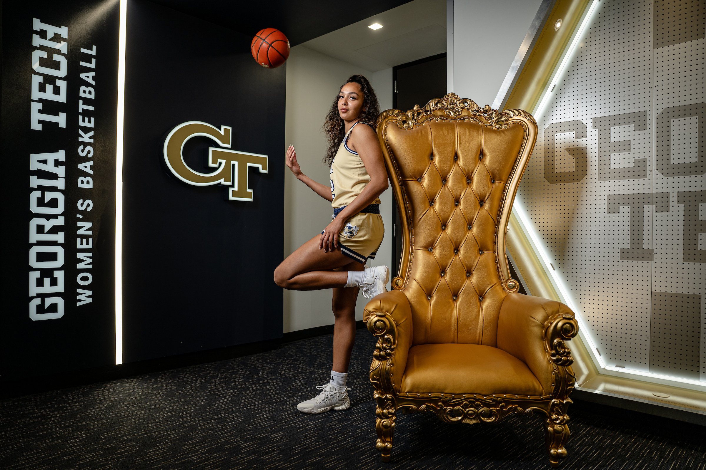
The new wordmark was widely embraced by fans and the Georgia Tech Athletics community. It became a central component in the program’s branding—appearing on team uniforms, facilities and merchandise, as well as in social media content and promotional videos. This cohesive visual identity enhanced the program’s reputation, increased brand recognition and increased marketability. Most importantly, it built a strong sense of pride and unity among teams and their supporters.
By unifying the athletic brand under a single, impactful identity, Georgia Tech Athletics successfully modernized its image while staying rooted in its traditions, achieving all key objectives.